Ink Saving Fonts: What Fonts Will Save You Money On Ink?
Which Fonts Save Money When Printing?
Hey, that fancy font may look good on your computer screen, but it’s going to send your print costs through the roof!
You need fonts that save money on ink and toner.
Choosing the right typeface keeps costs down. So does selling toner cartridges for cash.
Flashy Fonts Feast On Ink And Toner
Ornate, eye-catching fonts guzzle ink like there’s no tomorrow. The same goes for bold typefaces.
Big, eye-catching fonts, like Impact, use the most ink. These are not fonts that save money.
Fancy fonts are almost always ink and toner hogs, but other, more basic typefaces can also be heavy ink consumers.
No doubt you’ve used an Arial typeface before. It’s clean, easy to read, and shows up often on smartphones.
It’s also the default text if you’ve ever used Google Docs.
But Arial is a surprising ink glutton, using up to 20% more ink than comparable typefaces.
Arial may be a go-to font for digital designers, but look for an ink-sipping alternative when seeking fonts that save money.
Ink Adds Up! Use Fonts That Save Money!
Does using an extra drop or two of ink during a print job really matter?
Maybe not.
But fonts that use more ink take longer to print, and therefore, consume more electricity.
You’ll also run out of ink faster, which means more energy will be consumed manufacturing and shipping you a new ink cartridge.
Plus, you’ll be adding to a global waste problem, even if you recycle your empty plastic ink cartridge properly.
Removing ink from recycled paper is also a chemical-heavy task, and more ink makes it that much more difficult.
Okay, So What Font Uses the Least Ink?
Some fonts come with a family of related typefaces which use less ink.
Helvetica Condensed, for example, uses less ink than standard Helvetica.
Adjunct terms like “thin” or “narrow” are also a tip-off that a font will consume less ink.
Sans serif fonts lack the little curly-cues on the tips of the letters, and therefore usually consume less ink and toner.
8 Best Eco Fonts That Save Money On Ink and Toner
Here is the list of economical fonts that use less (and toner) ink when printing compared to others:
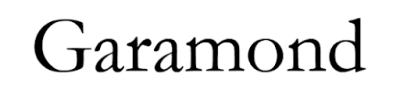
Named for famed French publisher and type designer Claude Garamond, this elegant font is often praised for its low ink consumption.
But that is because it’s a smaller, tighter typeface than most.
You can save an equal amount of ink by reducing the point size of other fonts.
A 10-point Times New Roman font will probably appear the same size as 12-point Garamond.
Regardless, Garamond remains a solid choice when you need a low-ink font that’s easy on the eyes.

Times New Roman has been a newsprint staple for decades.
This typeface dates back to 1931, and is economical thanks to its thin letters.
It’s interesting to note that Times New Roman contains serifs, yet still consumes less ink than most sans serif fonts.
Patrick Austin at Consumer Reports got 27% more use from an ink cartridge printing Times New Roman instead of Arial.

If you’re an Arial lover, (and who doesn’t love “The Little Mermaid”?), Calibri makes a good substitute when looking to save ink and toner.
Like Arial, Calibri is a sans-serif typeface, that’s clean and easy to read.
This simple-yet-effective font made its debut with the release of Microsoft Office 2007 and Windows Vista, and is a popular choice for many designers and typesetters.

Like Calibri, Century Gothic is also a no-nonsense, sans serif font that makes reading a pleasure.
However, Century Gothic’s spacing is a bit wider, so what you save on ink you may end up spending on additional paper use.
Century Gothic was designed with large-type headings and signs in mind, but it works quite well as body paragraph font too.
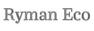
This funky eco-font was developed by UK office supply giant, Ryman Stationery.
Made of thin lines and hollow letters, Ryman Eco uses 33% less ink than standard fonts.
On type 12-points or smaller, you don’t even notice the hollow letters; Ryman Eco appears like a solid font.
But even at larger sizes Ryman Eco is still an easy font to read and fun to look at.
In addition, the creators of the font claim that if everyone in the world used Ryman Eco, it would save 490 million ink cartridges and 15 million barrels of oil, while reducing annual CO2 emissions by 6.5 million tons.

Ecofont isn’t just a typeface, (though Ecofont Sans is quite fetching) — it’s a lifestyle!
The company’s Ecofont software claims to reduce ink and toner consumption by as much as 50%.
How? By poking tiny holes in the letters of standard fonts, like Times, Verdana, and everybody’s favorite, Arial.
Like Ryman Eco, the holes are invisible on smaller font sizes, and oddly soothing when scaled large.

This classic “typewriter font” was designed with low ink consumption in mind. (You see, kids, back in the day, there were these big, clunky metal things called typewriters that used spooled ribbons moistened with ink…)
Courier letters are big, which helps it to be legible, yet thin, which makes it a penny-pinching font.
Plus, Courier is retro cool! Try it out on your next round of documents. Impress your friends and loved ones!

This is a sweet looking font, like something you’d find inside an old British library book.
In addition to being highly readable, Baskerville Old Face has the added benefit of being an ink and toner sipper.
Seattle ink shop Inkfarm.com analyzed 134 fonts and found Baskerville Old Face used roughly 37% less ink and toner than Arial.
Reading Baskerville Old Face is like a conversation with an old friend. Release the hounds!
0 comments
No comments yet.